What Is a Sonic Logo—and How to Make One That Works
Learn what a sonic logo is and how to make a sonic logo: steps, best practices, timing tips, and testing methods for memorable audio branding.
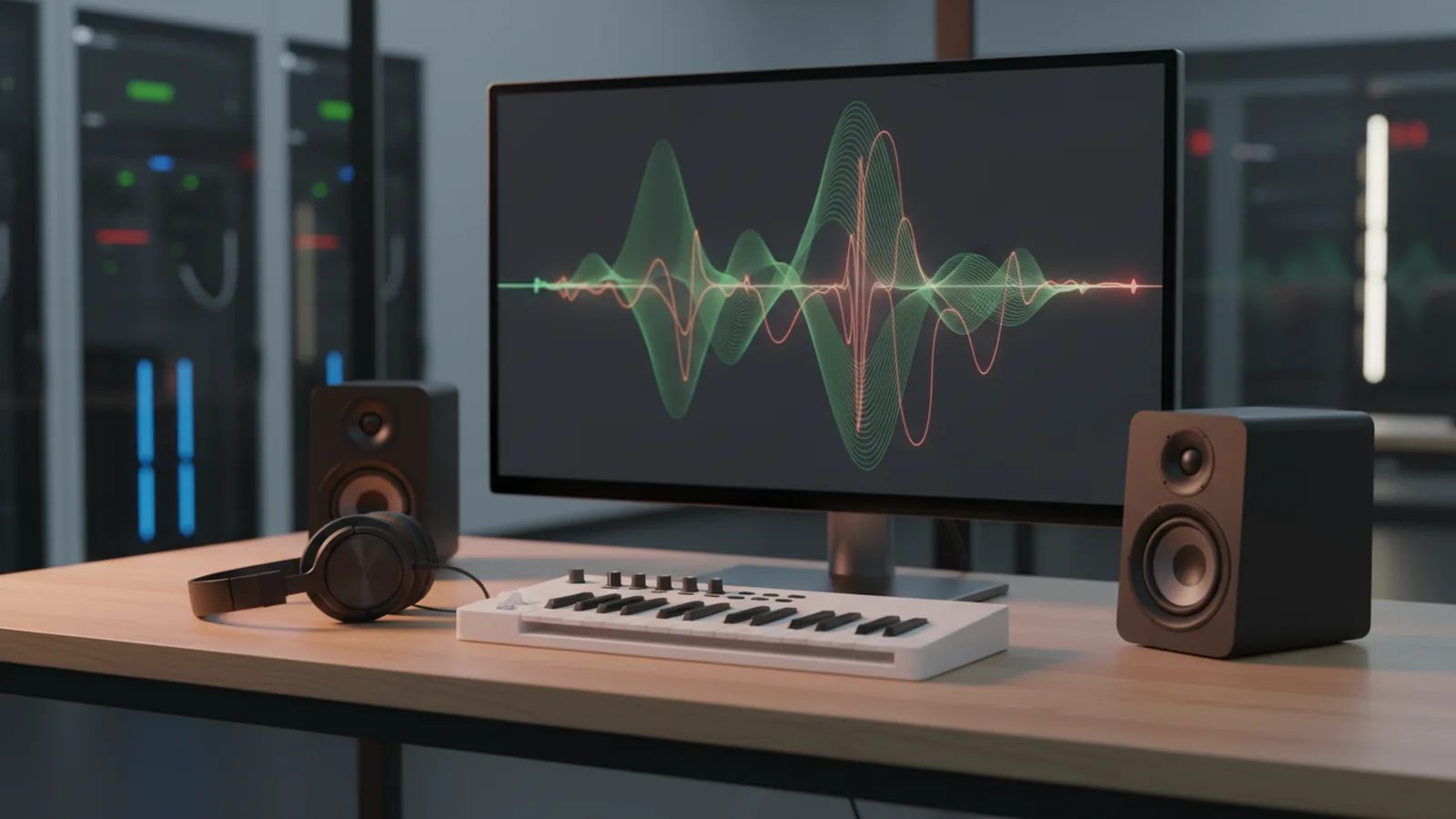
What is a sonic logo (and why it matters)
A sonic logo is a short, recognizable sound that functions like an audio version of a brand mark. It’s designed to be identifiable within a second or two - so people can recognize your brand even when they can’t see a screen. A good sonic logo also travels well across media: mobile apps, video pre-rolls, call center hold music, product tutorials, and accessibility-friendly experiences.
Most people encounter sonic branding through short “stingers” at the start or end of content, but the format is broader than that. Sonic logos can be as simple as a two-note motif with a consistent rhythm, or as developed as a melody that resolves over a 1–3 second span. In practice, teams often align the sound character (bright, warm, crisp, grounded) with the brand’s visual identity and values.
On the measurement side, audio cues work because the brain rapidly forms associations between patterns and meaning. The goal isn’t to be catchy for its own sake - it’s to create a cue that’s stable over time, easy to reproduce, and distinct from competitors. When done well, what is a sonic logo becomes a practical asset for consistency: the same “audio signature” shows up in every touchpoint.
Start with brand inputs and constraints
Before you touch a synth or recording app, define what the sonic identity needs to communicate. Collect 3–5 brand traits your audience should feel (for example: “reliable,” “playful,” “premium,” “calm,” “fast”). Then translate those traits into sound design targets: tempo range, brightness level, tonal center, and emotional contour (rising vs. falling, tense vs. resolved).
Next, decide the format constraints. Most teams target a sonic logo length of 1–3 seconds because it’s short enough for micro-moments but long enough to develop recognition. Consider how it will be used: a loopable motif for apps (often under 1.5 seconds) versus a fully composed stinger for video intros (often 2–3 seconds). Also plan for delivery requirements like loudness leveling and format conversion (for example, using consistent sample rates across assets).
Finally, identify what not to do. If you rely on trends (overly “futuristic” sound FX, overly compressed to the point of distortion, or generic pluck sounds used by many brands), you’ll fight recognition. A quick internal audit helps: list competitor sonic cues you’ve heard and make sure your motif avoids similar intervals, rhythms, or timbral profiles. This is a big part of how to make a sonic logo that doesn’t sound like background noise.
Design the motif: melody, rhythm, and timbre
The core of how to make a sonic logo is building a memorable motif - usually a small set of elements that remain consistent across versions. Start with melody (or pitch pattern) first. Even if the final sound includes richer production, the perceived “identity” often comes from the pitch contour and interval relationships.
Then add rhythm. People don’t just recognize pitches; they recognize timing. A steady pattern (like a 4-beat micro-phrase) can be easier to reproduce than a complex syncopation-heavy line, especially when the sonic logo must work on different devices. If you’re unsure, create 3 variants: one with a simple rhythm, one with a slightly syncopated rhythm, and one that emphasizes a percussive attack rather than sustained notes.
Timbre (the “what it sounds like” part) completes the identity. A sonic logo usually needs a signature timbre that doesn’t smear across devices. For example, a blend of a clean tone with a subtle harmonic “edge” can stay recognizable on earbuds and in speakerphone scenarios. Aim for timbre stability: if you swap instruments but keep pitch and rhythm, listeners should still recognize the brand cue.
A practical sketch workflow
Here’s a concrete way to move from idea to usable drafts in hours rather than weeks. Create a session and plan for multiple short renders so you can compare quickly. Use short loops to audition timing, then export candidate versions for review.
- Pick a tonal center: choose a comfortable pitch range for the brand’s emotional tone (e.g., mid-range for grounded, higher for energetic).
- Draft three pitch motifs: each motif should fit within 8–10 notes max, so you can keep it under ~2 seconds.
- Lock the rhythm: set a consistent grid (for example, quarter-note subdivisions) and avoid overly complex subdivisions.
- Choose one “signature” sound: a specific instrument type or synthesized timbre that matches brand traits.
- Render 5–10 candidates: keep variations controlled - change one element at a time (pitch, rhythm, or timbre).
Compose for recognition: length, harmony, and endings
Recognition depends on how quickly the listener can identify the cue. In many sonic logo use cases, people hear the sound with competing noise - traffic, notifications, or partial audio. That’s why a sonic logo often performs best when its defining elements appear early, typically within the first third of the sound duration.
Harmony and resolution matter even in short audio. If the logo “hangs” without a landing, it may feel unfinished and become harder to categorize. For short stingers, you can use one of two strategies: an immediate resolution (clean “home” moment early) or a gentle tension-release that lands by the end. The ending should feel intentional - especially if the sonic logo will be used as an “activation” cue.
Length should be deliberate, not arbitrary. For example, a 1.0–1.5 second logo can work well for notifications and app events, while a 2.0–3.0 second logo often feels more composed for video intros and brand films. A useful technique when you’re deciding how long to make it: compare candidate versions at the same loudness and scrub them quickly in a playlist to see which one remains identifiable without context.
When you’re building your drafts, include at least two “endings.” One ending can be a definitive stop (good for activation), while another can be a softer fade or resolve (good for transitions). This is often part of how to make a sonic logo that feels consistent across multiple placements.
Quick timing tests you can run immediately
Instead of debating in the abstract, test candidates with real listening conditions. Use a small set of recordings and play them through common playback devices (phone speaker, laptop, Bluetooth speaker). Then compare which sonic logo remains distinct when mixed with background noise.
- First-echo test: listen only to the first 0.5 seconds - can you identify the brand cue?
- Noise test: overlay the candidate on a simple noise bed and check whether pitch identity survives.
- Device test: switch between earbuds and phone speaker; timbre should remain recognizable.
- Context test: place the logo at the start, middle, and end of a short clip to verify usability.
Production and audio specs: make it usable everywhere
Once the motif is solid, production turns it into a deployable asset. Start with clean source audio or well-controlled synthesis so you don’t rely on effects that collapse on different systems. Reverb, for instance, can sound great in a studio but blur the pitch identity when played on a phone speaker.
Loudness consistency is another practical requirement. If your sonic logo is too quiet, it disappears; if it’s too loud, it can feel aggressive or clip. A common workflow is to render candidates, then normalize or level-match them so comparisons are fair. Even without deep mastering knowledge, you can keep output consistent by using the same loudness target across all candidate exports.
Finally, plan versioning. Teams typically produce a “main” sonic logo plus alternate mixes: a shorter cut for tight UI spaces, a version without tail reverb for clarity, and a version optimized for speakerphone or noisy environments. This approach also makes it easier to answer what is a sonic logo in operational terms: it’s not one file; it’s a set of closely related deliverables that keep the identity stable.
What to export
| Asset type | Purpose | Typical target length |
|---|---|---|
| Main sonic logo | Most brand placements | 1–3 seconds |
| Short cut | UI notifications and small moments | 0.6–1.2 seconds |
| Clean mix | High-clarity playback | Same as main |
| Tail mix | Transitions and brand videos | Same as main |
Test, iterate, and build a mini brand system
Testing is where “favorite sound” becomes “effective sonic identity.” Gather feedback from people who represent your audience - not just internal teams. Ask listeners to judge recognition (“Did you know it was brand-related?”) and distinctiveness (“Would you confuse it with another brand cue?”), and avoid asking only whether it “sounds cool.”
Run iteration with controlled changes. If you replace the instrument but keep pitch and rhythm, you learn whether timbre is the driver of recognition. If you change pitch but keep rhythm, you learn whether melody carries the identity. This structured approach speeds up how to make a sonic logo that works instead of re-rolling production endlessly.
Also document usage guidance so your sonic logo stays consistent. Specify how it should be triggered (at what moment), what playback volume range it should sit in relative to voice or music beds, and what to avoid (like heavy EQ that removes the signature frequency band). A small set of rules prevents quality drift when different teams implement the asset.
Feedback questions that produce actionable results
- Recognition: “Could you identify it even without seeing the screen?”
- Distinctiveness: “Does it feel meaningfully different from other brands you know?”
- Comfort: “Does it feel pleasant at low volume on a phone speaker?”
- Clarity: “Is the ending clear, or does it feel abrupt or unfinished?”
- Consistency: “Would it still work if shortened to about 1 second?”
Common mistakes when you make a sonic logo
One frequent issue is designing only for ideal listening conditions. A sonic logo that sounds great in studio monitors may lose pitch identity on small speakers. When you make a sonic logo, build in device checks early so you can avoid late-stage surprises.
Another common mistake is overproduction too soon. Layering multiple FX and sound sources can create a “rich” sound that becomes mushy when compressed or streamed. Keep the motif audible first; then add production elements that support recognition rather than masking it.
Finally, teams sometimes treat it like a one-off audio file instead of a system. If there’s no clean short cut, no clear mix, or no loudness plan, different teams will improvise and the brand identity will drift. How to make a sonic logo effectively includes planning versions and usage constraints from the start.
If you want a single takeaway: build your identity around melody/rhythm clarity, then ensure production choices preserve that identity across common playback contexts. That’s what transforms what is a sonic logo from a creative concept into a consistent brand asset.
FAQ about sonic logos
What is a sonic logo?
A sonic logo is a short, brand-recognizable sound used to identify a company in audio contexts. It works like an audio signature and is designed to be recognizable quickly and consistently across media.
How long should a sonic logo be?
Many sonic logos land between 1 and 3 seconds. Shorter versions (around 0.6–1.2 seconds) are also common for UI notifications and limited playback space.
Do you need a full melody?
Not necessarily. Some sonic logos rely on a simple pitch motif, a recognizable rhythm pattern, or a signature timbre. The key is that listeners can identify the sound consistently.
Should it be made with music instruments or sound effects?
Either can work, but the sonic identity must remain clear on small speakers. If you use sound effects, keep the pitch/rhythm cues audible and avoid tails or effects that blur the core motif.
How do you test a sonic logo before launching?
Run device tests (earbuds, phone speaker, Bluetooth), plus noise and context tests. Compare candidates by recognition and clarity rather than only by “liking” the sound.
Can a sonic logo work without music?
Yes. Many deployments are silent-background moments (notifications, activation cues), so the sonic logo should be identifiable on its own. If it’s always used under music, it may be harder for listeners to learn it as a distinct brand cue.
FAQ
- What is a sonic logo?
- A sonic logo is a short, recognizable sound that identifies a brand in audio contexts. It’s designed to be recognized quickly and stay consistent across media.
- How to make a sonic logo that people remember?
- Start by designing a simple motif with clear pitch and rhythm, then keep the signature timbre stable across versions. Test recognition on different devices and in noisy or mixed contexts.
- What is the ideal length for a sonic logo?
- Many sonic logos work well between 1 and 3 seconds. Short cut versions (roughly 0.6–1.2 seconds) are also useful for UI notifications.
- How to make a sonic logo work across phone speakers and earbuds?
- Avoid heavy reverb and ensure the motif is audible early in the sound. Run playback tests on phone speakers and earbuds and adjust the timbre for clarity.
- What common mistakes should you avoid when you make a sonic logo?
- Don’t overproduce early in a way that blurs the core motif, and don’t assume studio-monitors results will translate to small speakers. Also avoid skipping versioning and loudness consistency.
- How do you test a sonic logo before launching?
- Use first-echo and noise tests plus context placements at the start and end of clips. Ask for recognition and distinctiveness feedback rather than only personal preference.